Thursday, 22 November 2012
Monday, 12 November 2012
Music Magazine cover notes
Music magazine covers
The image
The image
- If there is a person/group on the cover, what do they represent?
- Are they a stereotype?
- How has this stereotype been constructed?
- The gaze refers to the direction in which the person on the cover is looking.
- Are they looking straight to the audience?
- Are they smiling?-enticing the reader in?
- Do they look friendly or cool?
- Do they look seductive?
No more than five models should be used.
Allowed to use real bands if you know them and they're reliable
The mission statement
Create a mission statement for your music magazine.
Read the example for the woman's music magazine 'Frank' and develop the following ideas for your own magazine.
The mission statement
Create a mission statement for your music magazine.
Read the example for the woman's music magazine 'Frank' and develop the following ideas for your own magazine.
- Explain what kind of music magazine you hope to create by focusing on genre and style
- Explain the audience that you are trying to target
- Give a brief overview of the content of your magazine
- Describe the tine and attitude of your magazine
- Explain the role that you think your magazine will play in the lives of it's readers
Tuesday, 6 November 2012
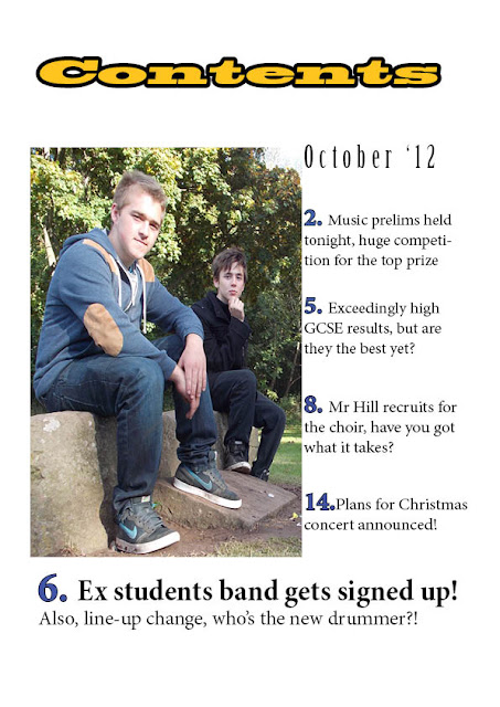
School Magazine contents page finished
for the 3rd draft/finished copy I have added coloured boxes around the page information, mainly to separate them and to draw the reader into reading them, I've also added a a page reference over the picture, I changed the colour of that to yellow as opposed to red, as the red wasn't aesthetically pleasing and didn't draw readers attention.
Monday, 5 November 2012
Contents page draft 2
This is my second computerised draft (using InDesign), I've added colour to the masthead and added some pages, I've decided to make the page numbers bolder and in a different colour so they stand out more
Contents draft
This is my drawn up rough idea of what my contents page will hopefully look like, I had to add it after the first computerised draft due to issues with cameras and things. I think it'll look good with a bit of colour added and a picture added, I've decided to only use one picture as I find just having one is the most effective and having more clutters up the page.
Subscribe to:
Comments (Atom)


