Sunday, 3 March 2013

Music magazine draft 4

For the fourth draft, i've decided to take out  the subsidiary image, I've started to add coverlines and experiment with different colour schemes. Nearing completion, I need to make sure this is finished fast in the coming weeks so I can start other areas of the magazine...


Music magazine front cover draft 3

For the third draft I've decided to re-position the subsidary image, and move the headline a little. No major changes.

Tuesday, 19 February 2013

Music magazine draft 2 InDesign


The second draft shows colour change on the banner, a subsidary image added (will be resized etc later) and a headline added.

Monday, 18 February 2013

Magazine front cover first draft using InDesign


The first draft, I think is quite good, it shows signs of a real music magazine, huge potential

Sunday, 17 February 2013

Music magazine front cover, drawn draft 1

This is my first drawn draft of my magazine front cover, as you can see, the masthead is big, bold and easy to read and would drawn attention to  potential customers, I will probably change a few of the coverline stories around and reposition a few things, however.


I aim to finish the whole front cover by Friday the 22nd Feb.

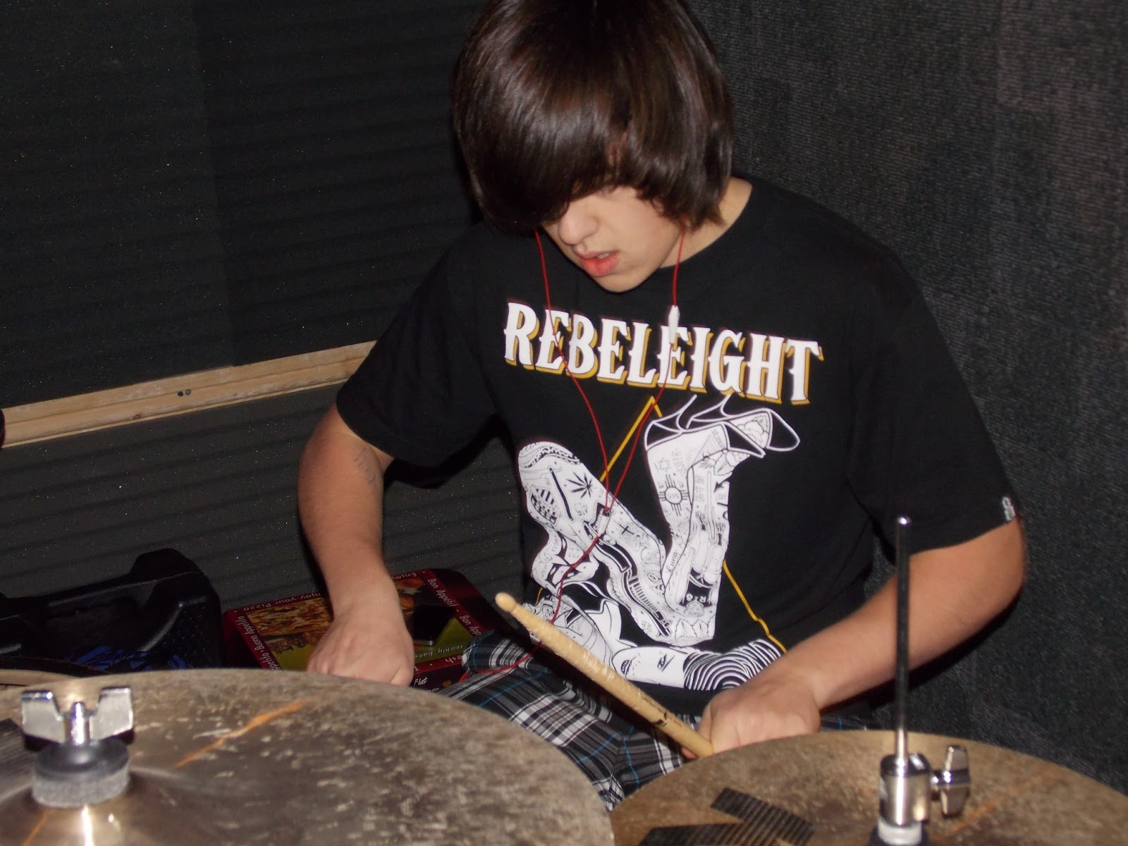
Some images I'm going to use throughout the magazine...

     
Highly edited photo, background taken out, the people have been re-positioned, could be used for a front cover image


Unedited version of the first image, would work as article page image

Unedited, possible article image

Similar to 3rd image, possible article photo

Unedited, could be use as subsidiary image on contents page

Unedited, could be used as a small photo or subsidiary image on the contents page

Similar to previous image, could be used on the contents page

Friday, 18 January 2013

Audience analysis/research

To gain opinions other than my own, I conducted an online survey from 'SurveyMonkey'

Here are the results (Printscreens) 10 people were surveyed


3 images on the front cover is what 40% of people voted, and also the highest vote, so I will use 1 main image and 2 smaller images

For the contents page, people believed more images should be used, with not one response favoring one image, however, 40% with the highest vote, favored 2 images, I personally though might go for around 3/4 with one main image and some subsidiary images.

Again people favored 2 images for the article page, with 30% of the respondents choosing this option

For the age group, staggeringly the majority or respondents were aged between 14-16 (70%)

For the name of the magazine, a few choices were given personally my favorites were "mosh!" and "drop tuning". As they both acquired the highest votes "with mosh! winning by 20% and drop tuning in joint second" I'm still unsure on which to choose. 

finally, I was shocked to see the participants being equal with 50/50, I expected a more male dominated survey.