1.What
is the function of a contents page?
The
function of a contents page is to present to the reader what's in the
magazine, it can also give quick idea of what's included in the
headlines, coverlines etc, but not in much detail, this is used to
make the reader want to read the rest of the articles. The contents
page is usually located straight after the front cover.
2.How
does a reader use a contents page?
The
reader uses a contents page by navigating the page, maybe finding an
article that attracts them, then going to that page, they may also be
just scanning the page, then find something interesting, then use the
contents page to address them where to go.
3.What
is the conventional layout for a contents page in a magazine?
The
conventional layout for a contents page in a magazine is to have a
sort of 'index' where lesser important things are shown, usually
located on the left or right of the page, and to have a main
‘headline’ being shown taking up most of the page to attract
readers to that article. There is also a usually a gird structure
with page numbers to identify the different articles. Like shown here
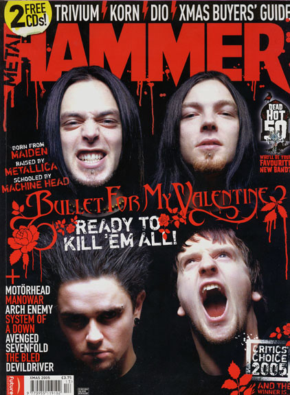
in this Metal hammer content page, there’s a space for the
‘features’ which is for the headlined stuff, then ‘regulars’
for the stuff that’s usually reviewed or analysed in the magazine.
There’s also a space for an ‘editor speaks’ which is an area
weekly for the editors opinion, this takes up the right hand column
of the grid structure, and could be a monthly reference for usual
buyers.
4.
What is the conventional design for a contents page in a magazine?
Most
magazines use roughly the same layout so it’s pretty universal, and
will be easy for new readers to the magazine to navigate their way
through the magazine. Usually a range of images or one big background
image is used to emphasize headlines or articles or to just simply
add some interesting colour.
5.
How much information does a contents page contain?
The
amount of information on a contents page can often vary between
magazines, for example, the image below has quite little information,
and has one big background image, rather that lots of little images
corresponding the article details. Whereas some contents pages of
different magazines can contain a lot of information, and ‘sneak
previews’ of important headlines.
6.
What information does a contents page contain?
The
information a contents page contains is usually an idea on what’s
to be expected on the rest of the magazine, rather than go into
detail with anything, this can be used to stop the use of things like
‘spoilers’ for keen readers. I think Rocksound give a good amount
of information as it keeps you in suspense for the rest of the
magazine then.
7.How
are images used in a conventional contents page?
Images
are sometimes used in contents pages to emphasize an article or piece
of information, or, as said earlier, can be used just to fill up
space and add a bit of colour to the page, they can also follow the
theme from the front cover, for example, the front cover may have an
image of a band on the front cover then have a different image of the
same band on the contents page.
8.
How is language used in a conventional contents page?
Language
is used in both formal and informal ways, depending on the magazine,
if it’s a critics wording or the general public, things like that
can contribute whether it’s formal or not, for example, an
interview with a band in a music magazine could be informal with
sometimes vulgar language.
9.
What are the key codes and conventions of a contents page?
The
key codes and conventions of a contents page are to have a good
balance between images and text, as having too much of either can
make the contents page hard to navigate and feel cluttered, and to
also have the text suggestive but not too informative, as that may
lead the reader to not want to read on.
10.
How does the function of a contents page affect its layout and
design?
The
function of the contents page must be for it to be simple and easy to
read/navigate and having too much on there could affect the layout by
making it cluttered and adjusting the main grid structure too much
could make the page feel really full and messy.


