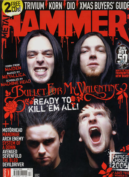
Music magazines of all genres have roughly the same target, to give readers information about interviews and gossip, gigs and tours, and new albums/singles and can also review things such as festivals and albums. Some magazines such as Kerrang! and Rocksound also have features such as weekly posters of featured bands to draw in readers and maybe include a Cd.
Usually big, mainstream artists are used for the main image, headline and coverlines, sometimes more upcoming bands are used in order to gain peoples attention and to help avoid criticism of 'promoting the same bands' on both magazines, world wide famous bands have been used.
Most music magazines of the metal/rock genre generally use the same colour scheme of red/white and black, where as a magazine focusing on more Pop music would use more brighter colours such as yellow pink and blue, this can sometimes be seen in rock magazines, but not as often.

Most contents pages of the rock/metal genre are quite standard and are usually just on one page rather than a two page spread, They don't use many big images, usually just one big one and a few smaller ones, as most of the images are in the rest of the magazines and posters etc. They both have basic grid structure layouts, but Metal Hammer on the right uses more smaller images whereas NME uses one main image, and an advertisement for someone to subscribe to the magazine, but both focus on giving reviews and analysis of the live scene of music.
My Genre...
the genre of my music magazine will be of the rock/metal genre, as I regularly read these types of magazines I can take some influence and some guidance on what I could do, I'm going to take influence from magazines such as Metal hammer, Rocksound, Kerrang and NME.


No comments:
Post a Comment