From spending a few months on analysis, mock ups of other magazines, then actually producing our own, I have realized it requires a HUGE amount of thinking and working to get up to the professional level, I have learnt how important it is to have the structure of a front page, well organised, and have the main image stand out to draw customers. I have learnt how colour schemes match, and perhaps not match.
From all of this I have also learnt a lot of in depth analysis about some of my favourite magazines, Kerrang! being one of them. I have learnt how most rock magazines follow the same colour scheme of red,white and black, and how magazines such as rock/metal differ from other genres in both main image and design of front page, pop magazines, for example have more clean cut, images of 'stars' on the front.
Monday, 17 December 2012
Kerrang magazine mock-up final draft

I think I've approached the mock up quite well, I could of taken a better picture, as I haven't re-created the background very well, but the main image of the male is pretty good, I couldn't do the other images because of lack of time. The main image instantly drags the reader into the front cover, which is positive. Where'as the masthead and coverlines are easily read. If I were to repeat something like this I'd touch up up the image and attempt to make it as close to the original as possible.
Kerrang! magazine mockup - draft 1

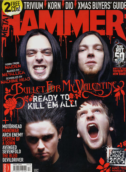
Chosen mock up magazine

This is my chosen magazine to mock up, admittedly, it was a terrible choice as it has lots of subsidiary images, the main image has a tricky background to re-create and there is alot of coverlines.
Sunday, 16 December 2012
Reader Profile
The reader of my magazine will be in the age of 14-21, 65% male, interested in metal/rock and it's subgenres,
The reader will listen to mostly contemporary music but may look back at the 'classics' such as Iron maiden, Metallica, Nirvana etc for inspiration and a sense of music from the past. The reader will be interested in live gigs and attend one at least once a month/whether it be local or national, and will buy music regularly, whether it be hard copy (cd/vinyl) or MP3 format (itunes, amazon mp3 etc) (at least 2 albums a month)
The reader will listen to mostly contemporary music but may look back at the 'classics' such as Iron maiden, Metallica, Nirvana etc for inspiration and a sense of music from the past. The reader will be interested in live gigs and attend one at least once a month/whether it be local or national, and will buy music regularly, whether it be hard copy (cd/vinyl) or MP3 format (itunes, amazon mp3 etc) (at least 2 albums a month)
Sunday, 9 December 2012
Mission statement
The music magazine I'm hoping to create will focus on the age group of 14-21, being interested in both rock and metal, the reader of the magazine will also be interested in the actual bands life, rather than just the music, and will also be interested in the live aspect of the genre,
The content of the magazine will include things like unsigned/underground new bands to check out, advice/opinions on which music to buy, readers and critics opinions, advice/opinions on what gigs to attend
The tone and attitude of the magazine will be of the general rock music magazine layout, using the colours, red, black and white, also, will offer promotions and chances to win merch and gig tickets of bands being featured.
Thursday, 22 November 2012
Monday, 12 November 2012
Music Magazine cover notes
Music magazine covers
The image
The image
- If there is a person/group on the cover, what do they represent?
- Are they a stereotype?
- How has this stereotype been constructed?
- The gaze refers to the direction in which the person on the cover is looking.
- Are they looking straight to the audience?
- Are they smiling?-enticing the reader in?
- Do they look friendly or cool?
- Do they look seductive?
No more than five models should be used.
Allowed to use real bands if you know them and they're reliable
The mission statement
Create a mission statement for your music magazine.
Read the example for the woman's music magazine 'Frank' and develop the following ideas for your own magazine.
The mission statement
Create a mission statement for your music magazine.
Read the example for the woman's music magazine 'Frank' and develop the following ideas for your own magazine.
- Explain what kind of music magazine you hope to create by focusing on genre and style
- Explain the audience that you are trying to target
- Give a brief overview of the content of your magazine
- Describe the tine and attitude of your magazine
- Explain the role that you think your magazine will play in the lives of it's readers
Tuesday, 6 November 2012
School Magazine contents page finished

for the 3rd draft/finished copy I have added coloured boxes around the page information, mainly to separate them and to draw the reader into reading them, I've also added a a page reference over the picture, I changed the colour of that to yellow as opposed to red, as the red wasn't aesthetically pleasing and didn't draw readers attention.
Monday, 5 November 2012
Contents page draft 2

This is my second computerised draft (using InDesign), I've added colour to the masthead and added some pages, I've decided to make the page numbers bolder and in a different colour so they stand out more
Contents draft

This is my drawn up rough idea of what my contents page will hopefully look like, I had to add it after the first computerised draft due to issues with cameras and things. I think it'll look good with a bit of colour added and a picture added, I've decided to only use one picture as I find just having one is the most effective and having more clutters up the page.
Tuesday, 30 October 2012
MusicMagazine Genre And Analysis
Music magazines of all genres have roughly the same target, to give readers information about interviews and gossip, gigs and tours, and new albums/singles and can also review things such as festivals and albums. Some magazines such as Kerrang! and Rocksound also have features such as weekly posters of featured bands to draw in readers and maybe include a Cd.
Usually big, mainstream artists are used for the main image, headline and coverlines, sometimes more upcoming bands are used in order to gain peoples attention and to help avoid criticism of 'promoting the same bands' on both magazines, world wide famous bands have been used.

Most music magazines of the metal/rock genre generally use the same colour scheme of red/white and black, where as a magazine focusing on more Pop music would use more brighter colours such as yellow pink and blue, this can sometimes be seen in rock magazines, but not as often.


Most contents pages of the rock/metal genre are quite standard and are usually just on one page rather than a two page spread, They don't use many big images, usually just one big one and a few smaller ones, as most of the images are in the rest of the magazines and posters etc. They both have basic grid structure layouts, but Metal Hammer on the right uses more smaller images whereas NME uses one main image, and an advertisement for someone to subscribe to the magazine, but both focus on giving reviews and analysis of the live scene of music.
My Genre...
the genre of my music magazine will be of the rock/metal genre, as I regularly read these types of magazines I can take some influence and some guidance on what I could do, I'm going to take influence from magazines such as Metal hammer, Rocksound, Kerrang and NME.
Thursday, 25 October 2012
Contents page draft 1

Sunday, 21 October 2012
Contents page
1.What
is the function of a contents page?
The
function of a contents page is to present to the reader what's in the
magazine, it can also give quick idea of what's included in the
headlines, coverlines etc, but not in much detail, this is used to
make the reader want to read the rest of the articles. The contents
page is usually located straight after the front cover.
2.How
does a reader use a contents page?
The
reader uses a contents page by navigating the page, maybe finding an
article that attracts them, then going to that page, they may also be
just scanning the page, then find something interesting, then use the
contents page to address them where to go.

3.What
is the conventional layout for a contents page in a magazine?
The
conventional layout for a contents page in a magazine is to have a
sort of 'index' where lesser important things are shown, usually
located on the left or right of the page, and to have a main
‘headline’ being shown taking up most of the page to attract
readers to that article. There is also a usually a gird structure
with page numbers to identify the different articles. Like shown here
in this Metal hammer content page, there’s a space for the
‘features’ which is for the headlined stuff, then ‘regulars’
for the stuff that’s usually reviewed or analysed in the magazine.
There’s also a space for an ‘editor speaks’ which is an area
weekly for the editors opinion, this takes up the right hand column
of the grid structure, and could be a monthly reference for usual
buyers.

4.
What is the conventional design for a contents page in a magazine?
Most
magazines use roughly the same layout so it’s pretty universal, and
will be easy for new readers to the magazine to navigate their way
through the magazine. Usually a range of images or one big background
image is used to emphasize headlines or articles or to just simply
add some interesting colour.
5.
How much information does a contents page contain?
The
amount of information on a contents page can often vary between
magazines, for example, the image below has quite little information,
and has one big background image, rather that lots of little images
corresponding the article details. Whereas some contents pages of
different magazines can contain a lot of information, and ‘sneak
previews’ of important headlines.

6.
What information does a contents page contain?
The
information a contents page contains is usually an idea on what’s
to be expected on the rest of the magazine, rather than go into
detail with anything, this can be used to stop the use of things like
‘spoilers’ for keen readers. I think Rocksound give a good amount
of information as it keeps you in suspense for the rest of the
magazine then.
7.How
are images used in a conventional contents page?
Images
are sometimes used in contents pages to emphasize an article or piece
of information, or, as said earlier, can be used just to fill up
space and add a bit of colour to the page, they can also follow the
theme from the front cover, for example, the front cover may have an
image of a band on the front cover then have a different image of the
same band on the contents page.
8.
How is language used in a conventional contents page?
Language
is used in both formal and informal ways, depending on the magazine,
if it’s a critics wording or the general public, things like that
can contribute whether it’s formal or not, for example, an
interview with a band in a music magazine could be informal with
sometimes vulgar language.
9.
What are the key codes and conventions of a contents page?
The
key codes and conventions of a contents page are to have a good
balance between images and text, as having too much of either can
make the contents page hard to navigate and feel cluttered, and to
also have the text suggestive but not too informative, as that may
lead the reader to not want to read on.
10.
How does the function of a contents page affect its layout and
design?
The
function of the contents page must be for it to be simple and easy to
read/navigate and having too much on there could affect the layout by
making it cluttered and adjusting the main grid structure too much
could make the page feel really full and messy.
Tuesday, 16 October 2012
School magazine draft 4

For the 4th draft, I have re-arranged the coverlines because I think they were obstructing the person on the left, I changed the outline colour of the headline and re sized the masthead as I feel it was cluttering the top of the magazine and the people. I can now use layers well...
Monday, 15 October 2012
School magazine cover draft 3

For the 3rd draft, I've added a background, changed the masthead to something more appropriate for the image by adding a black background, changing the colours of the words and re-arraging the position, also changing the colour and position of the coverlines.
Thursday, 11 October 2012
School magazine cover draft 2

I have used InDesign to re-draft my magazine cover, I've changed some of the colours and added a barcode...
Wednesday, 10 October 2012


Monday, 8 October 2012
School magazine first draft

This is a first computerised draft of my school magazine, I have used Adobe Indesign for all of the templates and editings, I think the masthead stands out well and would fit well in front of an image, although, the colour scheme could be more specific and be more bold as some of the text is more 'easily readable' than others. The coverlines could be more colourful and have a bugger font as they aren't that easily recognisable. I have learnt today how to add 'strokes' to the text and how to place text upon an A4 sized page.
Class work 08/10/12
Functions for indesign
1. Create a new document – A4 - check 08/10/12
2. Show document grid - check 08/10/12
3. Use rectangle frame tool - check 08/10/12
4. Use type tool - check 08/10/12
5. Select font - check 08/10/12
6. Change text size - check 08/10/12
7. Use colour picker - check 08/10/12
8. Create text effects using the stroke function - check 08/10/12
9. Use layers - check 08/10/12
10. Import an image using adobe bridge
11. Change image size
12. Crop an image
Tuesday, 2 October 2012

Subscribe to:
Comments (Atom)