Thursday 2 May 2013

7. Of Evaluation

7.Looking back at your preliminary task,  what do you feel you have learnt in the progression from it to the full product?

I feel as if I've progressed hugely  from the early stages to now...

Front cover


From first glance of the front cover, you can immediately see where things have improved, dominantly on the amount of content on the page, there is much more content on my real task than the preliminary task, also on the preliminary task, there is alot of 'empty space'. I also think the use of colour on the real task is much better, as there are no 'collisions' such as the purple onto the trees in the background makes the masthead feel obstructed and doesn't have that 'thrown off the page' effect.

I have also learnt that the masthead must stand out, as well as the cover story, as this could bring in potential customers, from the preliminary task to my real task, I think that both the placement and colour of the masthead on my real task is much more suitable for the page as it's easily recognisable and doesn't obstruct the image.

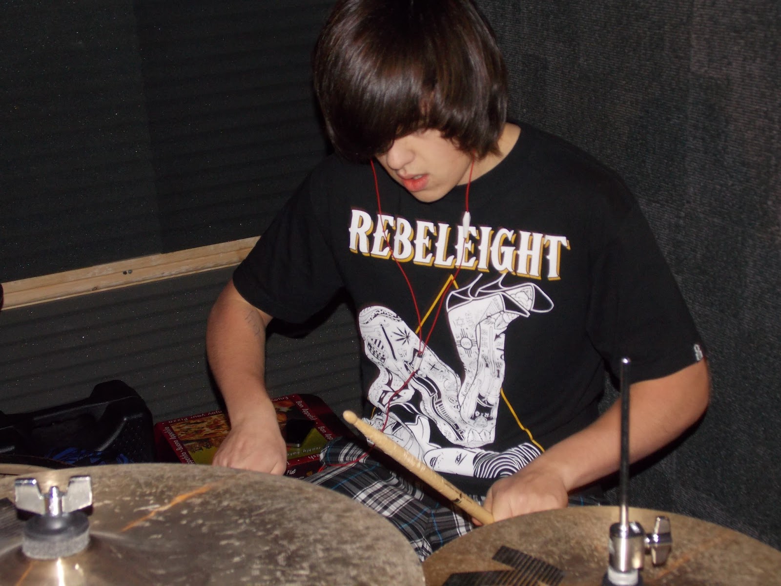
For the main image, I think the real task image is better, as it's posed better, without so much background (a effect I wasn't trying to re-create). it also allows for better positioning of coverlines.


The coverlines from my preliminary task look basic and amateur, as they aren't easily readable and aren't placed well, where-as on the real task I think the use of the bold yellow colour makes the coverlines stand out, without obstructing the image in the background.

For the preliminary task, I didn't add anything at the top or bottom of the  magazine (apart from a barcode) but for the real task, I added information both at the top and bottom with a black background to make it stand out much better.


Contents page


I think again the contents page is alot more developed, for a start, there are more subsidiary images, which can be a good point for a contents page as images can interest readers more than words, my preliminary task doesn't contain the 'editors corner', also, the cover story is shown better in my real task, with the image, page number, and a little text being given to it, where as, for the preliminary, it's just a bit of text with a red outline.

In my preliminary, there is alot of empty space, but in both contents pages I have added more pages to look it more realistic. There is more of a sense of a 'grid structure' in the real task. The use of main image in the preliminary, however not bad, still has plenty of room for improvement, where as I think the image choices of the real task are much better fitting onto the page.


Double Page Article


The real article was the first article I had any experience of doing, as we didn't do any for the preliminary task/mock, I felt the article is a big mixture of the front cover and the contents page, this is due to the fact that to do the title, it needs to be structured in a way in which the masthead of the front cover would be structured. The information and subsidiary images on the right have to be structured and placed in a way in which the information and subsidiary images on the contents page will be placed.

Conclusion

From doing both the preliminary and real tasks, I can conclude that there is a huge step up in quality needed to succeed in the real attempt. Simple things like text placement needs to be thought about very thoroughly, Images need to be posed specifically, and if they're posed wrong, might not work on the page it's going on. I also have a sense of time-keeping with the pages, it's surprising how time consuming it can be to design and produce something such as the contents page.


Wednesday 1 May 2013

6. Of Evaluation

6.What have you learnt about technologies from the process of constructing this product?


5. Of Evaluation

5.How did you attract/address your audience?

I decided to use informal language throughout my magazine (although trying to stay professional) as my influences such as Rocksound use this approach in text, (however, Metal Hammer, because it's target audience is older than Rocksound/Kerrang, uses more formal text)


For my front cover, you can see that i've kept things informal, the band name 'Sharks & Danger' is rather informal, as with the pose of the band, I've stuck with the red, black and white colour scheme, but added a yellow as I wanted to mix the influences from Kerrang and Rocksound (Rocksound regularly uses bold, bright colours such as light blue and yellow)


For the article, I've again stuck with the laid back atmosphere, especially with the interview, as it suggests that the band also has a laid-back attitude, which the readers could probably relate to/ the colour scheme is the same as the front, but with a more dark sense due to the background, the title could create a sense of wonder, as it's rather unusual, which could want the reader to read the article, rather than skim read until they find something that hugely interests them, which is what most readers of magazines do.


My contents page, I think, would  attract my audience well, as I think, very quickly, they would be attracted to the 'win' section, as that guitar is very expensive, and could be used as a tool for 'showing off' to their friends, I also think the reader would be attracted to the main image, as the little annotation 'insomnia rocks' can be seen as rather peculiar.  I think the reader would also be drawn in by the amount of content, the 'albums' section could appeal to people interested in studio music, where-as the gig section could interest people interested in the live aspect of music, basically, there's something for almost all rock fans here.


4. Of Evaluation

4.Who would be the audience for your media product?

The target audience for my magazine is teen-young adult, specifically 14-21.


The readers of my magazine would take use of the free posters and other goodies, which could all add up. For example, many fans of Kerrang and Rocksound take advantage of their free weekly posters, and build 'poster walls' in their room, this is a good way for the readers of the magazines to feel involved in a community, which is what I hope will happen to my magazine audience.


The audience of this magazine would be interested in the live aspect of music, as rock music can be focused around the live aspect heavily, plus, the readers would be interested in reading about the 'gigs' section of the magazine.


For the outfit/style of my audience, I feel as if they're going to be wearing similar clothing to the bands that will be featured in the magazine, some brands that both bands and readers alike will both possibly be wearing are, Converse, Vans, Drop Dead! wearing skinny jeans, maybe another bands t shirt (Iron Maiden and Metallica seem to be popular)


Due to the majority (not all) of mainstream rock/metal bands being male dominated, I think that the percentage of readers will be 65%  male and 35% female, as the males will look up to established bands for inspiration (especially people learning guitar. For hair, I think the majority of the readers will have medium to long length hair, as bands usually have long  hair so they'll take influence from that.


I think the readers of my magazine ( more the young adults around the age of 18 as opposed to teen) will buy records/cds from cd shops such as HMV and independent record shops such as Spillers records in Cardiff. I think they'll do this because they will have alot of passion for the bands they like so would go out and buy their cd (maybe even at one of their gigs) to show support, as opposed to using a social networking or other methods to listen to their music.


Tuesday 30 April 2013

3. Of Evaluation

3.What kind of media institution might distribute your media product and why?


If I were to distribute my magazine, I would probably chose Bauer media.

Bauer is a very well established company, from womens weeklies to film magazines, Bauer sells over 200 magazines in 15 countries. Bauer also own many different forms of cross media platforms, including radio, tv and online, because of this, I think it wouldn't take long for my magazine to become one of the top flight magazines.

Bauer also works closely with Frontline - a company who distribute magazines, this is an advantage in choosing Bauer as they could get my magazines distributed at ease.

There is a huge negative though. Kerrang. I think my magazine is too closely related to Kerrang, and because so many of Kerrang's readers already have their trust in Kerrang and are loyal to the magazine, I think it would be hard to gain any huge amount of readers, as probably most of the readers of my magazine genre, would already be interested in Kerrang, however, if they for some reason don't like Kerrang, they could trial 'Mosh!' 

There is also another I could chose. IPC. IPC are obviously in huge contest with Bauer, so they could be needing a magazine of  the rock/metal genre,(they already have NME, but that's more for indie.)

2. Of Evaluation

2.How does the media product represent paticular social groups


My magazine is targeted towards the age group 14 - 21 which is the rough age target for magazines such as Kerrang! and Rocksound  I feel I have made this point.


As you can see from a real magazine,  from the guy at the front, you can see that he's posing with a specific facial feature, this is also shown in my magazine with all sense of huge 'seriousness' taken out. I also think subsidiary image of the woman in the real magazine and the male on the right in my magazine are posing similar, completely by accident.

Their dress sense is similar, with the people on the cover of Rocksound wearing bright clothes of a 'pop punk' style, and the people on my magazine front cover are wearing informal clothes, and having logos on t-shirts, this goes against the stereotypes of metal and rock being 'dark' and 'emo' but maybe suggests the new sub-genres it's producing, which are more colorful


By looking at the use of the guitar and linking it to the masthead, one could instantly assume it's of a metal/rock genre 


 From the article, the sense of immaturity and 'no seriousness' is still shown, with dialogue like 'insomnia rocks' which is popular in modern rock bands and the sense of an easy-going atmosphere is shown, though 'Lew's terrible drumming' I think the target audience will appreciate the use of humor, which is also found in magazines of a similar genre.


From the contents page, you immediately get the idea that it's a contents page from a rock genre magazine, in the main image there is the same sense of wearing laid back clothes with logos, which is also the clothes of the target audience, the use of props of drum sticks and guitars also screams "rock!"


Saturday 27 April 2013

1. Of Evaluation

1.In what ways does your media product use, develop or challenge forms and conventions of real media products?


Monday 22 April 2013

Contnts page Draft 5/final draft

For the fith and final draft, I've repositioned the photo of the guitar to the bottom, as It looked cluttered at the top, added a website to the bottom, also I've filled in the information for the 'Editors Corner' which i think stands out due to it's black outline surrounding.

Contents page draft 4

 For the fourth draft, I've repositioned alot of things, moved the 'posters' section to allow space for an additional image. I think the additional image is great as it really spices things up on the page. I've also added boxes around the information so it's easier to read, I've also created space for a editors corner and I've taken a shot of the front cover and postioned it very small in the corner. This also increases the aesthetics, and makes iteasier to view.

Contents page draft 3

For the third draft I've only added basic information added more page references, etc.

Contents page draft 2

For the second draft, I've added some more information (page numbers to be directed to, features information etc) and also resized alot of the work so it fits better on the page.

Contents page draft 1

For the first draft, I've re-used the image from the article(the article is a cover story so it gives the reader a idea of whats to come), added the heading with the issue date and issue number and used a smaller subsidary image, I've also made a start on the structure of the page and started to add some information in.

To achive capitalisation in articles etc

To achieve the capitalisation select word or paragraph, option chose is type>paragraph. A little box appears, chose the bottom left little icon. Colours and text types can be then changed. Ususally 3-6 lines long…
To achieve text wrap create a layer 2, type what is wanted into the box (resize etc can be used) go to window, text wrap, the best one to use is the 3rd on from the left.


Monday 25 March 2013

Article draft 4, possible final draft


for the fourth draft I've re-positioned the title, making it fit better on the page, added a title onto the second page, and changed around the position of the subsidiary image and heading for that. I've also added  page numbers and logos and credits on the image.

Article draft 3


for my third draft I've changed the image, added a title and added a title to the subsidiary image, whilst also changing the position of the text

Article draft 2


For my second draft I've added in a background colour, black, and added a subsidiary image to the second page, and also changed the colours of the text and added sub headings.

Article draft 1


for my first draft i have added the photo and the text, after doing this I can see that it all fits in well, and there isn't too much text.

Friday 8 March 2013

Music magazine front cover draft 5, possible final draft.


For the 5th draft I have added more coverlines and touched up on the position of some things, I think this could be my final draft and finished front cover.

Sunday 3 March 2013

Music magazine draft 4

For the fourth draft, i've decided to take out  the subsidiary image, I've started to add coverlines and experiment with different colour schemes. Nearing completion, I need to make sure this is finished fast in the coming weeks so I can start other areas of the magazine...


Music magazine front cover draft 3

For the third draft I've decided to re-position the subsidary image, and move the headline a little. No major changes.

Tuesday 19 February 2013

Music magazine draft 2 InDesign


The second draft shows colour change on the banner, a subsidary image added (will be resized etc later) and a headline added.

Monday 18 February 2013

Magazine front cover first draft using InDesign


The first draft, I think is quite good, it shows signs of a real music magazine, huge potential

Sunday 17 February 2013

Music magazine front cover, drawn draft 1

This is my first drawn draft of my magazine front cover, as you can see, the masthead is big, bold and easy to read and would drawn attention to  potential customers, I will probably change a few of the coverline stories around and reposition a few things, however.


I aim to finish the whole front cover by Friday the 22nd Feb.

Some images I'm going to use throughout the magazine...

     
Highly edited photo, background taken out, the people have been re-positioned, could be used for a front cover image


Unedited version of the first image, would work as article page image

Unedited, possible article image

Similar to 3rd image, possible article photo

Unedited, could be use as subsidiary image on contents page

Unedited, could be used as a small photo or subsidiary image on the contents page

Similar to previous image, could be used on the contents page

Friday 18 January 2013

Audience analysis/research

To gain opinions other than my own, I conducted an online survey from 'SurveyMonkey'

Here are the results (Printscreens) 10 people were surveyed


3 images on the front cover is what 40% of people voted, and also the highest vote, so I will use 1 main image and 2 smaller images

For the contents page, people believed more images should be used, with not one response favoring one image, however, 40% with the highest vote, favored 2 images, I personally though might go for around 3/4 with one main image and some subsidiary images.

Again people favored 2 images for the article page, with 30% of the respondents choosing this option

For the age group, staggeringly the majority or respondents were aged between 14-16 (70%)

For the name of the magazine, a few choices were given personally my favorites were "mosh!" and "drop tuning". As they both acquired the highest votes "with mosh! winning by 20% and drop tuning in joint second" I'm still unsure on which to choose. 

finally, I was shocked to see the participants being equal with 50/50, I expected a more male dominated survey.